CSS Navigation Bar
Demo: Navigation Bars
Navigation Bars
Having easy-to-use navigation is important for any web site.
With CSS you can transform boring HTML menus into good-looking navigation bars.
Navigation Bar = List of Links
A navigation bar needs standard HTML as a base.
In our examples we will build the navigation bar from a standard HTML list.
In our examples we will build the navigation bar from a standard HTML list.
Example
<ul>
<li><a href="default.asp">Home</a>
</li>
<li><a href="news.asp">News</a>
</li>
<li><a href="contact.asp">Contact</a>
</li>
<li><a href="about.asp">About</a>
</li>
</ul>
Try it Yourself
Now let's remove the bullets and the margins and padding from the list:
Example explained:
list-style-type: none;- Removes the bullets. A navigation bar does not need list markers- Set
margin: 0;andpadding: 0;to remove browser default settings
Vertical Navigation Bar
To build a vertical navigation bar, you can style the <a> elements inside the list, in addition to the code above:
Example explained:
display: block;- Displaying the links as block elements makes the whole link area clickable (not just the text), and it allows us to specify the width (and padding, margin, height, etc. if you want)width: 60px;- Block elements take up the full width available by default. We want to specify a 60 pixels width
You can also set the width of <ul>, and remove the width of <a>, as they will take up the full width available when displayed as block elements. This will produce the same result as our previous example:
Example
ul
{
list-style-type
: none;
margin
: 0;
padding
: 0;
width: 60px;
}
lia
{
display: block;
}
Try it Yourself
Vertical Navigation Bar Examples
Create a basic vertical navigation bar with a gray background color and change the background color of the links when the user moves the mouse over them:
Example
ul {
list-style-type
: none;
margin
: 0;
padding
: 0;
width
: 200px;
background-color
: #f1f1f1;
}
li a {
display
: block;
color: #000;
padding
: 8px 16px;
text-decoration: none;
}
/* Change the link color on hover */
li a:hover {
background-color: #555;
color
: white;
}
Try it Yourself
Active/Current Navigation Link
Add an "active" class to the current link to let the user know which page he/she is on:
Example
.active {
background-color
: #4CAF50;
color
: white;
}
Try it Yourself
Center Links & Add Borders
Add text-align:center to <li> or <a> to center the links.
Add the border property to <ul> add a border around the navbar. If you also want
borders inside the navbar, add a border-bottom to all <li> elements, except for the
last one:
Example
ul {
border
: 1px solid #555;
}
li {
text-align
: center;
border-bottom
: 1px solid #555;
}
li:last-child {
border-bottom
: none;
}
Try it Yourself
Full-height Fixed Vertical Navbar
Create a full-height, "sticky" side navigation:
Example
ul {
list-style-type
: none;
margin
: 0;
padding
: 0;
width
: 25%;
background-color
: #f1f1f1;
height
: 100%; /* Full height */
position
: fixed; /* Make it stick, even on scroll */
overflow: auto; /* Enable scrolling if the sidenav has too much content */
}
Try it Yourself
Note: This example might not work properly on mobile devices.
Horizontal Navigation Bar
There are two ways to create a horizontal navigation bar. Using inline or floating list items.
Inline List Items
One way to build a horizontal navigation bar is to specify the <li> elements as inline, in addition to the "standard" code above:
Example explained:
display: inline; - By default, <li> elements are block elements. Here, we
remove the line breaks before and after each list item, to display them on one lineFloating List Items
Another way of creating a horizontal navigation bar is to float the <li> elements, and specify a layout for the navigation links:
Example
li
{
float
: left;
}
a
{
display
: block;
padding: 8px;
background-color
: #dddddd;
}
Try it Yourself
Example explained:
float: left;- use float to get block elements to slide next to each otherdisplay: block;- Displaying the links as block elements makes the whole link area clickable (not just the text), and it allows us to specify padding (and height, width, margins, etc. if you want)padding: 8px;- Since block elements take up the full width available, they cannot float next to each other. Therefore, specify some padding to make them look goodbackground-color: #dddddd;- Add a gray background-color to each a element
Tip: Add the background-color to <ul> instead of each <a> element if you want a full-width background color:
Horizontal Navigation Bar Examples
Create a basic horizontal navigation bar with a dark background color and change the background color of the links when the user moves the mouse over them:
Example
ul {
list-style-type
: none;
margin
: 0;
padding
: 0;
overflow
: hidden;
background-color
: #333;
}
li {
float
: left;
}
li a {
display
: block;
color
: white;
text-align
: center;
padding: 14px 16px;
text-decoration: none;
}
/* Change the link color to #111 (black) on hover */
li a:hover {
background-color
: #111;
}
Try it Yourself
Active/Current Navigation Link
Add an "active" class to the current link to let the user know which page he/she is on:
Right-Align Links
Right-align links by floating the list items to the right (float:right;):
Example
<ul>
<li><a href="#home">Home</a>
</li>
<li>
<a href="#news">News</a></li>
<li><a href="#contact">Contact</a>
</li>
<li style="float:right"><a class="active" href="#about">About</a></li>
</ul>
Try it Yourself
Border Dividers
Add the border-right property to <li> to create link dividers:
Example
/* Add a gray right border to all list items, except the last item (last-child) */
li {
border-right: 1px solid #bbb;
}
li:last-child {
border-right
: none;
}
Try it Yourself
Fixed Navigation Bar
Make the navigation bar stay at the top or the bottom of the page, even when the user scrolls the page:
Note: These examples might not work properly on mobile devices.
Gray Horizontal Navbar
An example of a gray horizontal navigation bar with a thin gray border:
Example
ul {
border
: 1px solid #e7e7e7;
background-color
: #f3f3f3;
}
li a {
color
: #666;
}
Try it Yourself
More Examples
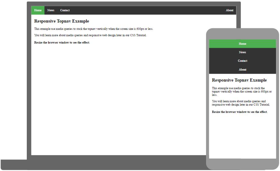
Responsive Topnav
How to use CSS3 media queries to create a responsive top navigation.

Try it Yourself
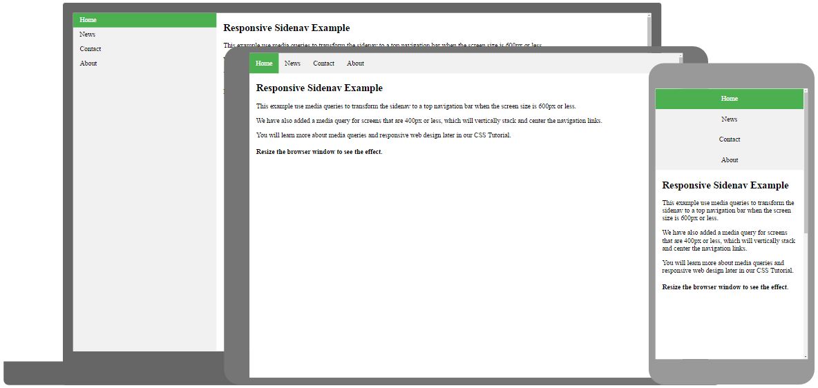
Responsive Sidenav
How to use CSS3 media queries to create a responsive side navigation.

Try it Yourself